




"Cool" interiors have a habit of going sideways. You want fresh, airy, summery — and you end up with a bleached, slightly clinical room that nobody actually wants to sit in. This guide walks through how to keep a home feeling cool in summer without losing the warmth that makes it human: the right colors, the materials that quietly do the work, and the design cues used by contemporary designers like Vincent Van Duysen, Studio KO and Norm Architects.

There is a familiar mistake people make every summer. The days warm up, the windows go open, and we reach — almost reflexively — for the white paint, the white linen, and a vague idea that "minimalism" will make the room feel like a holiday. A week later, the room is whiter, but somehow flatter. Quieter, but harder to relax in. Cooler, but… cold.
This is the classic problem of designing for summer: cool is not the same thing as warm-cool. The fresh, airy rooms you actually want to live in — the ones photographed in Architectural Digest and The World of Interiors every July — are not white boxes. They are layered, neutral and natural, with one or two cool tones doing the freshness and a careful set of materials doing the warmth.
Below: how to make your home feel cool in summer without losing what makes it human, with a few field notes from the designers who have already solved this problem.
In this article
- Why "all white" is not always the answer
- The best summer colors for a fresh but warm room
- How do I stop cool colors from feeling too cold?
- What materials work best in hot months?
- Can wallpaper or pattern make a room feel cooler?
- How do I choose lighting that doesn't overheat the mood?
- The fresh-warm room formula
- Bottom line: cool, not cold
Why "all white" is not always the answer
White feels safe, which is partly the problem. In strong summer sunlight, pure white can read as harsh, almost glaring. In rooms without enough texture, it flattens everything into one note. Without natural materials nearby, it tips into clinical — closer to a dentist's waiting room than a Mediterranean cottage.
The fix is not "don't paint walls white." It is: white needs company. Texture, wood, ceramic, linen — something with body and warmth to keep it from going cold. Warm whites (those with a yellow or pink undertone) almost always feel softer than pure whites. Layer them with sand, oatmeal, stone or pale clay underneath and the room reads as fresh rather than bleached.
The best summer colors for a fresh but warm room
If you want a slightly more rigorous reason to pay attention to color: a much-cited study from the University of Bologna on interior color and psychological functioning found that long-term exposure to interior color influences mood, calm and even study performance. Blue and green tones in particular were associated with calmer states. Color is not a gimmick — it is one of the longest-lasting decisions in a room.
The summer palette that consistently reads as fresh without going cold:
- Sage green
- Soft blue
- Sand
- Oatmeal
- Warm white
- Pale clay
- Light terracotta
- Stone grey
- Washed olive
You do not need all of them. Three is usually plenty — one wall colour or large textile, one mid-tone for cushions or ceramics, one accent for art or smaller objects.
Try this todayWalk into the room you most want to feel "summery." Count the cool surfaces (white walls, glass, metal, screens) and the warm surfaces (wood, ceramic, linen, plants). If it is more than 3 to 1 in favour of cool, the room is going cold regardless of color. Add one warm surface — a wooden tray, a ceramic vase, a linen throw — and the temperature shifts immediately.
How do I stop cool colors from feeling too cold?
This is the part that designers actually understand and the rest of us learn the hard way. Color does not work in isolation. It works together with light, texture and context — which is why a cool palette almost always needs natural materials to keep it feeling human.
The Belgian designer Vincent Van Duysen — whose work shows up in Molteni&C catalogues, Aman hotels and basically every "warm minimalism" mood-board — describes his palette in three words: calm, sensorial, modest. In practice it means: a cool wall always sits next to a warm material. A pale sofa always sits on something tactile. The "minimalism" is the discipline of fewer things; the "warmth" comes from making sure each of those things is something you actually want to touch.
The pairings below almost always work:
- Blue with oak
- Sage with linen
- Warm white with ceramic
- Grey with jute
- Pale green with brass
- Sand with rattan
- Stone with terracotta
The Copenhagen studio Norm Architects — known for what they call "soft minimalism," and the firm behind interiors for brands like Menu, Audo Copenhagen and Aiayu — has spent a decade arguing essentially this point. Quiet palettes need tactile companions. Otherwise minimalism stops being calm and starts being cold.

What materials work best in hot months?
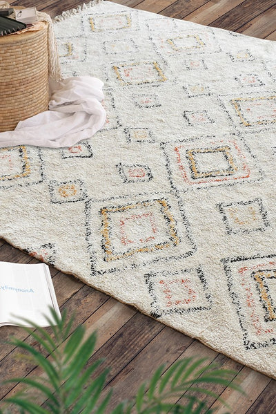
The summer-friendly material palette is short and almost foolproof. Linen, cotton, bamboo, rattan, light woods, jute, paper and ceramic all share a quality that synthetic fabrics never have: they look as cool as they feel. A linen cushion in place of a velvet one, a rattan pendant instead of a metal shade, a jute rug under a small woven one — small swaps with a disproportionate effect.
The other rule worth remembering: choose one highly textured piece per room. A chunky jute rug or a limewash-toned vase reads as airy because it adds visual depth, not because it adds clutter. Our overview of materials that bring nature closer is a useful starting point if you want to plan a room by material rather than by color.

Can wallpaper or pattern make a room feel cooler?
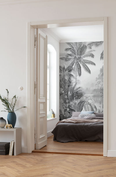
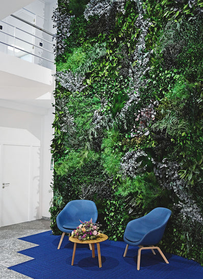
Yes — and pattern is one of the most under-used tools in summer styling. Nature-inspired patterns work hardest here. The Terrapin Bright Green research report on the 14 Patterns of Biophilic Design identifies biomorphic forms, fractal patterns and natural analogues as some of the most psychologically restorative pattern types we know of. They also happen to be summery: leaves, branches, ripples, soft curves, the kind of repetition you actually see in nature.
In a real home, that looks like:
- Leaf and branch motifs in botanical mural wallpaper.
- Water-like movement in canvas prints.
- Soft curves in furniture silhouettes.
- Repetition found in nature — pinecones, ferns, ripples — translated into textile patterns.
One pattern is usually enough. A whole room of pattern stops reading as nature and starts reading as a wallpaper showroom.

How do I choose lighting that doesn't overheat the mood?
Cold, bright LED bulbs make a sage wall look hospital-grey. Warm bulbs at low intensity restore the depth that made you pick the wall colour in the first place. The Blume, Garbazza and Spitschan review on light and human circadian rhythms is a useful reminder that lighting is not only decorative — even in summer, warm low light at night supports the body's wind-down, while cool overhead light pushes against it.
For a fresh, summery, but still warm room:
- Use warm bulbs (2200–2700K — it should say on the box).
- Choose ceramic or natural lampshades that diffuse light rather than glare.
- Cluster smaller lamps instead of one overhead. Three pools of warm light at sitting height almost always feel better than a single ceiling source.

The fresh-warm room formula
If you only remember one formula from this article, this is it:
Cool color + warm material + natural texture + soft light + one organic pattern.
Hit all five and a room will feel fresh and welcoming at the same time, without tipping into either cluttered or cold.
Bottom line: cool, not cold
Summer rooms do not need to be bleached, all-white or empty. They need a quiet palette held together by warm materials and one or two natural patterns. That is the unglamorous truth behind every cool-but-cozy interior you have ever loved in a magazine — and behind every great Aman lobby, Studio KO project and warm-minimalist Scandinavian flat.
You do not need to repaint anything. You just need to make sure that for every cool surface, there is a warm one nearby.
Explore our botanical mural wallpaper, natural textiles, ceramic lighting and plant wall art — or browse our collections by colour tone.




Leave a comment