
If you spent any time on Pinterest or Instagram over the last decade, you know the look: brilliant white walls, pale floors, bleached wood, and rooms so pristine they almost felt untouched.
At first, it felt fresh. Clean. Modern. A kind of visual reset.
But after years of living with stark white interiors, many of us are craving something different. Not clutter. Not maximalism. Not a return to heavy, traditional rooms. What we want now is warmth. Texture. Depth. A home that still feels refined, but no longer feels cold.
That is why cream and walnut are becoming the defining neutral palette of 2026.
This combination offers everything people once loved about white interiors — lightness, simplicity, calm — but with a richer, more human feeling. Cream softens the room. Walnut grounds it. Together, they create interiors that feel elegant, tactile, and deeply comfortable.
It is quiet luxury, but with soul.
Here is exactly why the cream and walnut combination is the new foundation for a calm home, and how you can actually pull it off without it feeling dated.
What is the cream and walnut palette?
Before we go further, it is worth clarifying what this palette really means.
Cream does not mean the flat yellow-beige walls many of us associate with dated interiors from the early 2000s. In 2026, cream is softer, more natural, and more nuanced. Think ivory, oat, bone, chalk, warm plaster, unbleached linen, and pale stone. These are shades that still feel light and airy, but with enough warmth to make a room feel calm rather than clinical.
Walnut, in the same way, does not simply mean “dark wood.” It is richer and more dimensional than that. True walnut has depth, visible grain, and natural variation. It can range from warm chocolate brown to deeper espresso tones, often with subtle golden, red, or purple undertones. That complexity is what makes it feel luxurious.
Together, cream and walnut create a palette that is both soft and structured. Cream brings the light. Walnut brings the depth. The result is a neutral scheme that feels warm, grounded, and timeless rather than plain.

Why this palette feels right for 2026
The rise of cream and walnut is not just about color. It reflects a bigger shift in how we want our homes to feel.
For years, interiors were designed to look perfect on a screen: bright, clean, edited, and almost untouched. But the homes we are drawn to now feel more sensory. They invite you to sit down, make coffee, read slowly, gather around a table, and actually live in the space.
That is why this palette feels so current. It keeps the simplicity and restraint people still love about modern interiors, but replaces coldness with comfort. It is minimalism with warmth. Luxury with softness. Design that feels considered, but not staged.
In 2026, the most beautiful homes are not the ones that look the most perfect. They are the ones that feel the most restorative. Cream and walnut answer that need beautifully.
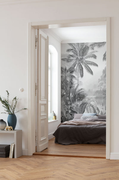
Why we're moving away from stark white
The all-white interior was once the symbol of modern taste. It made spaces feel bigger, brighter, and more edited. But in many homes, that brightness eventually became harsh.
Pure white reflects a lot of light. In a sunny space, that can create glare and make a room feel visually tiring rather than restful. Instead of feeling serene, the room can start to feel clinical.
To understand this science behind this, we have to talk about how the human eye processes contrast and light.
In interior design, we use something called Light Reflectance Value (LRV). This is a scale from 0 (absolute black) to 100 (pure white) that measures how much light a color reflects. When a room is entirely high-LRV (all pure white and light gray), there is nowhere for the eye to rest. It lacks depth. On the flip side, a room that is too dark feels cave-like and heavy.
Cream solves this beautifully.
Unlike stark white, cream absorbs just enough light to feel soft. It creates a diffused glow rather than a sharp reflection. The result is a space that still feels bright, but warmer, calmer, and easier to live in.
Cream and walnut strike the perfect biological balance. Cream has a slightly lower LRV than pure white. It absorbs just enough light to eliminate that harsh, clinical glare, wrapping the room in a soft, diffused glow. Walnut, on the other hand, is a deep, rich, low-LRV material. When you put a dark walnut dining table against a textured cream wall, you provide the eye with a strong, definitive "anchor."
It is not about making the room darker. It is about making the light feel better
This balance of a soft, expansive background (cream) and a heavy, grounding foreground (walnut) creates an environment that our brains interpret as stable and secure. It is the exact psychological comfort we discuss in our guide on how interior design affects mental health.
Why walnut is the perfect contrast
Walnut has always had a sense of luxury, but in 2026 it feels especially relevant because it brings back something interiors have been missing: grounding.
For years, pale woods dominated. Bleached oak, gray-washed finishes, and light Scandinavian-inspired pieces were everywhere. They made rooms feel airy, but often lacked depth.
Walnut offers a more mature alternative.
The key is to use it with restraint. Today’s walnut is not heavy or oversized. It works best in clean, sculptural, and organic forms: a refined coffee table, a slim sideboard, a carved bowl, a dining chair, a tray, or a beautifully grained accent piece.
You do not need a room full of walnut. In fact, one strong piece is often enough.
A walnut coffee table on a cream rug. A dark wood console against a textured wall. A hand-finished bowl on a pale stone surface. These small moments create the anchor that makes the entire space feel more intentional.

Photo extended from Adrain Gaut ©
Beautiful examples of cream and walnut in architecture
If you want to see how this pairing works in the real world, you just have to look at the architects and designers who are defining the current "quiet luxury" and warm minimalism movements.
Take the work of Vincent Van Duysen, the acclaimed Belgian architect and artistic director for brands like Molteni&C. Van Duysen is famous for creating spaces that are incredibly minimal, yet deeply warm and tactile. He almost never uses stark white paint. Instead, his walls are often a rich, plaster-like cream, bone, or pale taupe. Against this soft canvas, he layers heavy, dark, smoked woods and deep walnut tones.
The result is a space that feels monastic, quiet, and timeless.

Similarly, look at the styling work of Colin King, who has defined the visual language of modern home decor in the 2020s. King constantly uses the friction between light and dark. He will place a vintage, heavily grained walnut bowl on a creamy limestone counter.

Why their approach works
These designers understand that minimalism doesn't have to mean "cold." By limiting their color palette to cream and walnut, they force you to notice the texture of the materials. The room stops being about loud colors and starts being about the quality of the wood grain and the softness of the light.
How to get the "cream" right
The biggest fear people have when introducing cream into their homes is that it will look like the cheap, yellowish "builder-grade beige" of the early 2000s.
To make cream look like a 2026 luxury neutral, you have to follow one strict rule: Never use flat paint.
Flat, untextured cream paint lacks dimension. When light hits it, it looks dead. To make cream work, it has to have texture. The texture catches the light, creating micro-shadows that give the color depth and movement.
-
Textured walls: Instead of plain paint, designers are using limewash, Roman clay, or heavily textured wall coverings. If you want to warm up a living room, applying a subtly textured, warm-toned wallpaper instantly softens the acoustics and the light in the room, creating a beautiful cream canvas.
-
Textured fabrics: If you can't change your walls, bring cream in through textiles. Swap out your bright white cotton throw pillows for raw, unbleached linen or heavy bouclé from our Earthy & Neutral Collection. The physical weave of these fabrics makes the cream color feel intentional and expensive.
-
Warm lighting: Cream walls only work if your lighting supports them. If you use cool-toned LED bulbs, cream will look sickly and green. You must use warm bulbs (around 2700K) housed in Sustainable Lighting fixtures made of natural linen or rattan to cast a soft, amber glow that makes cream walls look incredibly inviting at night.

How to style walnut without it feeling heavy
The key to using walnut today is the shape of the furniture. We aren't talking about the massive, chunky, heavy wooden furniture of the 1990s. The new way to use walnut is through sleek, organic, and architectural forms.
A mid-century inspired walnut sideboard with tapered legs, or a beautifully carved wooden accent piece from our Earthy & Neutral Collection, adds massive visual weight to a room without making it feel cluttered.

Benni Olive Wood Boards and Kaya Tableware
Because walnut has such a strong visual presence, you don't need a lot of it. It acts as a grounding anchor. A single walnut coffee table sitting on a cream-colored rug is often all you need to completely change the center of gravity in your living room.
Lighting makes or breaks the palette
Cream and walnut are deeply affected by lighting.
Under cool bulbs, cream can look dull, yellow, or even slightly green. Walnut can lose its richness. But under warm lighting, the whole palette comes alive.
Choose bulbs around 2700K for a soft, warm glow. Natural fiber shades, linen lamps, rattan pendants, and ceramic bases work especially well because they add another layer of texture.
In the evening, this is where the palette becomes most beautiful. Cream walls glow. Walnut deepens. The room starts to feel intimate, calm, and quietly luxurious.
The third element is greenery
While cream and walnut are a perfect pair, a room entirely composed of just two colors can eventually feel a bit flat. Every great interior needs a "bridge" element—a third color or texture that ties the background and the foreground together and adds a spark of life.
When working with warm neutrals and dark woods, the absolute best bridge element is the deep, vibrant green of the natural world.
Green sits perfectly opposite the warm, reddish-brown undertones of walnut on the color wheel. When you place a hit of greenery next to a piece of walnut furniture, both colors instantly look richer and more vibrant.
If you don't have the time or the natural light to maintain a massive indoor garden, this is where Preserved Moss Art becomes your best design tool.
Hanging a large, vibrantly green moss frame against a textured cream wall, positioned right above a walnut console table, creates the ultimate 2026 vignette. It combines the softness of the cream, the grounding history of the wood, and the biological necessity of nature into one perfect sightline.

Photo extended from Rich Stapleton ©
The colors and materials that complete the palette
Cream and walnut can stand beautifully on their own, but the right supporting tones make the whole palette feel richer and more personal.
Olive green is one of the most natural companions. It brings an organic note that sits beautifully beside walnut and keeps cream from feeling too quiet.
Soft black adds definition. Used sparingly through a lamp base, picture frame, chair leg, or hardware, it gives the room structure without disrupting the warmth.
Warm stone, taupe, and clay tones deepen the palette in a subtle way. They add a grounded, earthy feeling that makes cream and walnut feel even more natural.
Muted terracotta can bring a gentle warmth, especially through ceramics, textiles, or artwork. It should feel sun-baked and soft rather than bright orange.
Aged brass works beautifully as a metallic accent. Its warmth complements walnut without competing with it, especially in lighting, handles, trays, and small decorative details.
Natural materials are just as important as color. Linen, wool, bouclé, rattan, jute, travertine, limestone, handmade ceramic, and woven fibers all help the palette feel layered rather than flat.
The goal is not to add more colors for the sake of it. It is to create a quiet, tonal world where every material feels warm, tactile, and connected.
How to use cream and walnut in every room
The beauty of this palette is that it can work throughout the home without feeling repetitive. The key is to adjust the balance of cream, walnut, texture, and greenery depending on the mood of each room.
Living room
In the living room, let cream create the softness. A cream sofa, textured rug, linen curtains, or plaster-toned wall can form the base. Then add walnut through a coffee table, side table, shelving, picture frame, or sculptural bowl. Finish with ceramics, warm lighting, and a touch of greenery to keep the space relaxed and layered.
Bedroom
In the bedroom, use cream to make the room feel restful. Think unbleached linen bedding, a wool throw, soft curtains, and a warm neutral rug. Walnut works beautifully in smaller doses here, such as nightstands, a bed frame, a bench, or a simple tray. The goal is calm, not contrast that feels too sharp.

Dining room
In the dining room, walnut can take a more central role. A walnut dining table instantly gives the room presence, especially when paired with cream upholstered chairs, stoneware, linen napkins, and a simple ceramic centerpiece. This is where the palette feels especially timeless: warm, welcoming, and made for gathering.

Kitchen
In the kitchen, cream cabinetry, warm stone counters, handmade tiles, or ceramic lighting can soften the room, while walnut open shelving, stools, cutting boards, or cabinet details add depth. The combination feels clean without becoming sterile.
Entryway
In the entryway, a walnut console against a cream wall creates an immediate sense of warmth. Add a ceramic lamp, a woven basket, a mirror with a dark wood or aged metal frame, and a branch arrangement or moss artwork for a simple but memorable first impression.
Bathroom
In the bathroom, cream works beautifully through stone, tile, towels, and textured walls. Walnut can appear in a vanity, stool, mirror frame, or small accessories. Paired with warm lighting and natural textures, the palette turns a functional room into something more spa-like and serene.
What to avoid when styling cream and walnut
As effortless as this palette can look, it works best when the details are intentional. The wrong undertone, finish, or proportion can quickly make the room feel dated or heavy.
Avoid flat yellow-beige walls.
This is what can make cream feel old-fashioned rather than elevated. Look for creams with a soft, natural undertone, and bring them in through textured materials wherever possible.
Avoid too much dark wood.
Walnut is powerful because it has visual weight. A little goes a long way. If every major piece in the room is dark wood, the space can start to feel heavy. Use walnut as an anchor, not as the entire foundation.
Avoid cool gray undertones.
Cream and walnut are warm by nature, so cool grays can make the palette feel disconnected. Instead, pair them with taupe, warm stone, clay, olive, linen, or soft black.
Avoid overly glossy finishes.
High-shine cream walls or lacquered dark wood can make the palette feel more dated than luxurious. Matte, satin, honed, brushed, woven, and hand-finished surfaces feel much more current.
Avoid matching every wood tone perfectly.
A beautiful room should not feel like a furniture showroom. Walnut can live comfortably alongside lighter oak, aged wood, rattan, and woven natural fibers, as long as the overall undertones feel warm and considered.
Avoid harsh blue-white lighting.
This may be the fastest way to ruin the palette. Cool bulbs flatten cream and make walnut look dull. Warm, layered lighting is essential.

Start with one grounding piece
If you are not ready to redesign an entire room, start with one grounding piece.
A walnut accent can completely shift the mood of a space. It might be a coffee table, sideboard, tray, bowl, frame, stool, or serving board. Against a cream backdrop, even a small dark wood detail can make the room feel more intentional.
From there, layer in softness. Add cream-toned textiles, handmade ceramics, warm lighting, natural fiber shades, and organic greenery. These pieces do not need to match perfectly. In fact, the palette feels most beautiful when it looks collected over time.
This is where the cream and walnut look becomes easy to live with. It does not ask for perfection. It asks for warmth, texture, and a few well-chosen pieces that bring the room back to balance.
Bringing it all together
The reason cream and walnut feel so right now is simple: they make a home feel human again.
After years of sharp whites, cool grays, and spaces designed to look flawless from a distance, this palette brings us back to materials we can feel. Soft linen. Warm wood. Handmade ceramics. Natural light. A room that looks beautiful, but also invites you to slow down.
Cream gives the home its softness. Walnut gives it its grounding. Texture gives it depth. Greenery gives it life.
Together, they create the kind of neutral palette that does not feel like a trend, even though it is defining the moment. It feels calm, timeless, and deeply livable.
Start small. Warm the lighting. Add one walnut piece. Replace stark white textiles with cream, oat, ivory, or linen. Bring in ceramics, natural fibers, and something green.
Little by little, your home will stop feeling like a showroom and start feeling like a place to truly rest.
Ready to bring warmth back into your home? Explore the Earthy & Neutral Collection at Forest Homes and discover the textured, grounding pieces that make the cream and walnut palette come alive.


Leave a comment